Until It's Gone Digipack
Overview
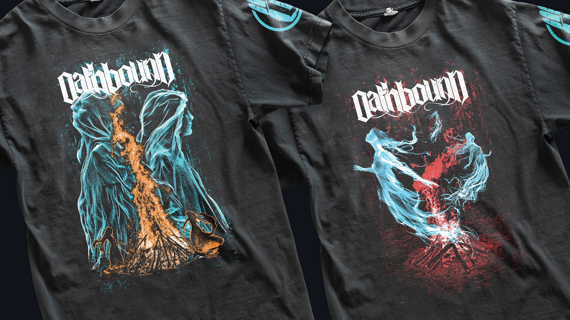
After collaborating on band T’s, Oathbound brought me back to finalize the Digipack for Until It’s Gone.
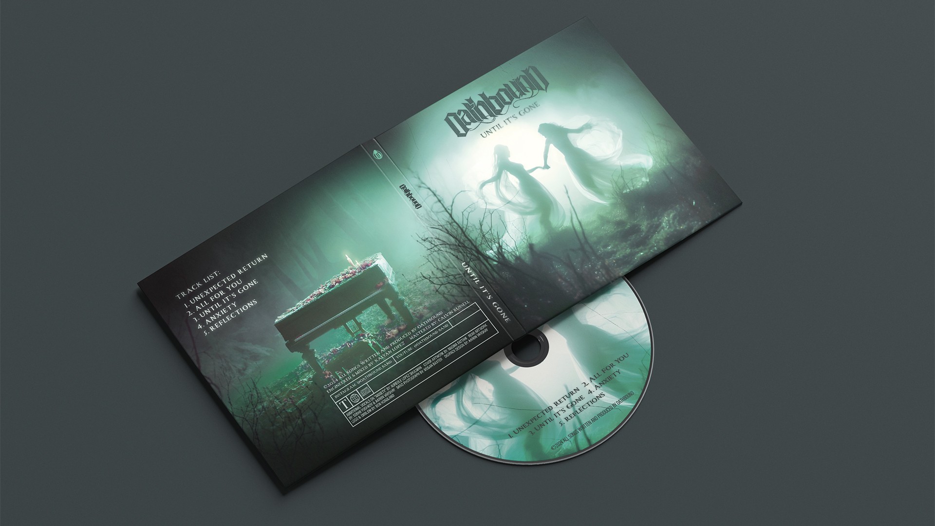
I redesigned the exterior, interior, and CD graphics, refining the front and back cover art to create a cohesive, striking presentation. The final Digipack printed flawlessly, and the band was thrilled with the results.


Approach
Oathbound provided artwork, graphics, and copy, but the back cover needed a complete rework. In a creative session with the band’s lead, we explored ways to align it thematically with the EP’s message of loss and remembrance. A simple yet powerful idea emerged—a vigil on a piano—which seamlessly tied into the front cover.
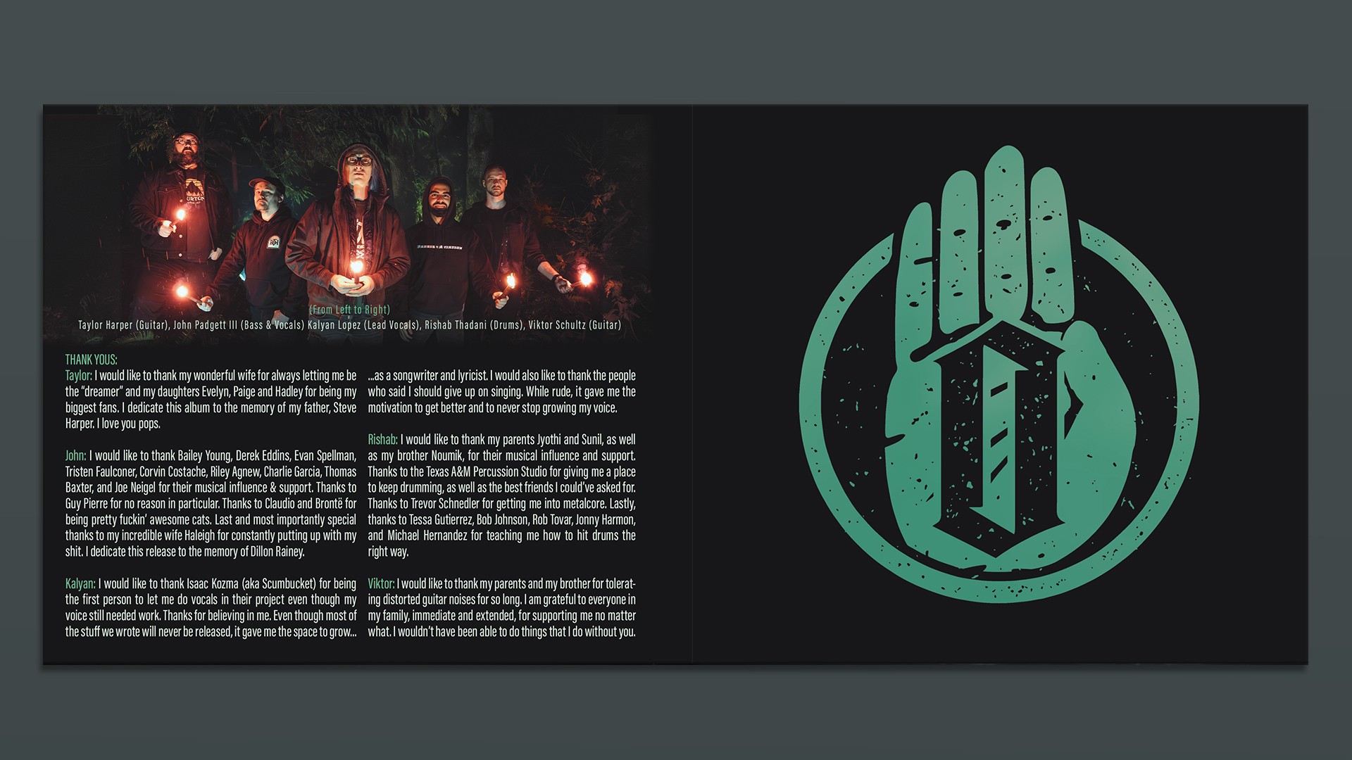
I reworked the back art, integrated it with the spine to form a unified piece, and polished the front cover. The interior layout flowed smoothly except for a text-heavy thank-you page. To maintain readability, I used a condensed font and structured it into columns for a clean, balanced look.
For the CD design, I simplified the approach—centering the cover art’s two figures while adding subtle cracks, reinforcing the album’s theme of fragility. This final touch gave the design extra depth and personality.