

Oathbound - Colors in Grey
Role
Creative Direction, Illustration, Merch Design, & Packaging Design
Brief
Oathbound needed a cohesive visual identity and compelling illustrations for their first LP, Colors in Grey, that would span cover artwork, promotion, merchandise, and packaging.
Creative Direction
I connected the campaigns visuals around themes of transformation, light in void, and stone figures shattering. These motifs encapsulated Colors in Grey's messages around re-emergence, breaking through, and were translated into a cohesive visual system that bridged the album's cover art, music videos, and merchandise for the album release.
Deliverables
Album Cover
2 Single Covers
Digipack Packaging
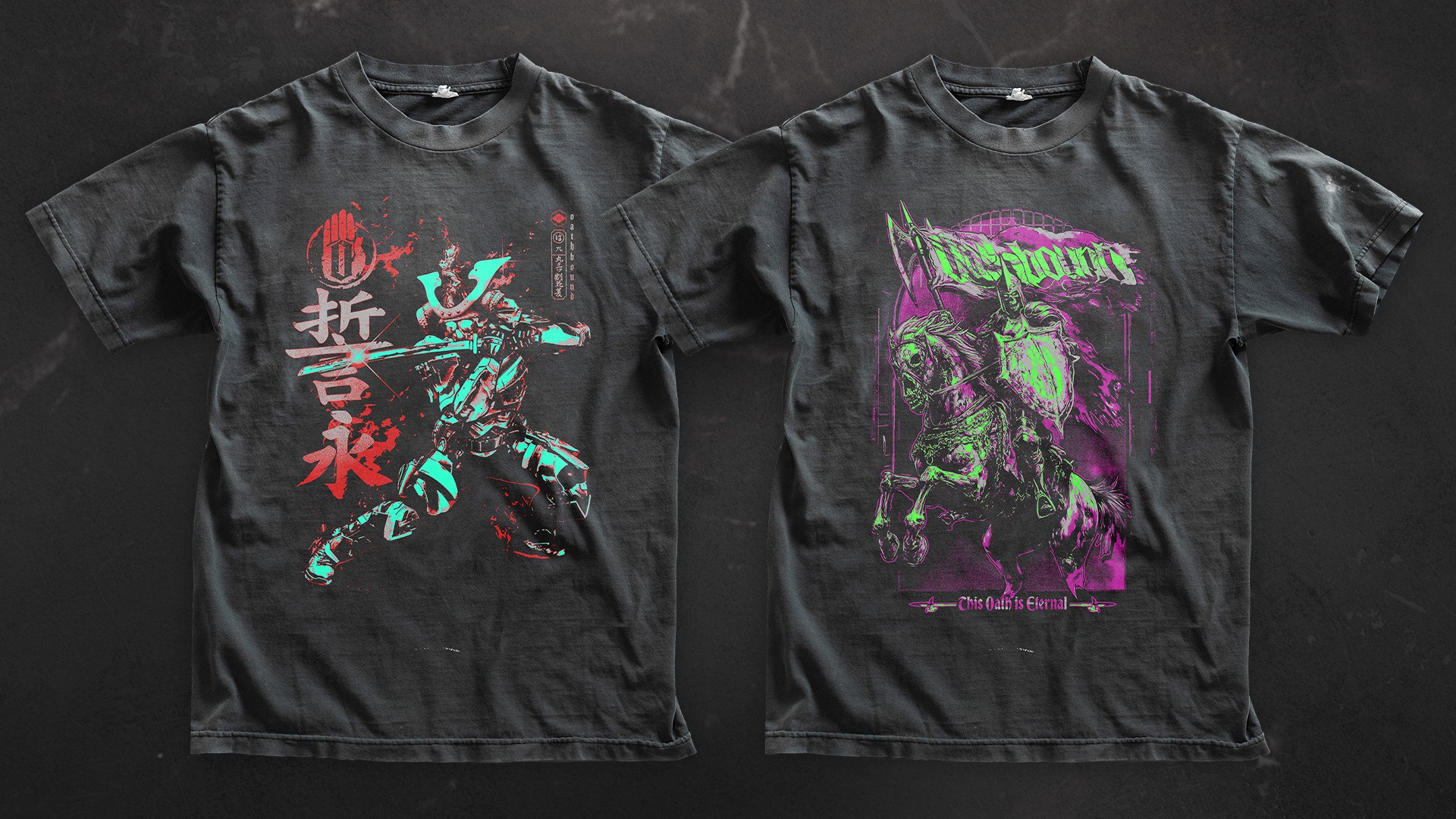
3 T-Shirt Designs
1 Long Sleeve Shirt Design
1 Tour Poster
Results
The 'Fallen Rider' shirt design nearly sold out it’s first run of shirts on tour, and is a best seller at their merch table
All merch designs sold well, made returns for the band, and have needed to be re-stocked
Colors in Grey released with a strong, cohesive visual identity


Year
2025-2026
Project Link